Data Bar Reference
Overview
Data Bar replaces a cell's plain numeric content with a small diverging bar: a track split at a zero axis, with the bar extending toward the positive or negative side depending on the cell's value. It works cell by cell — every data cell of the table (including sub-total and total columns) gets its own bar, scaled against a single, table-wide axis so bars stay comparable across the whole table.
Location: Format pane → Data Bar card → master toggle Show data bars.
Bar value — what drives the length
Setting: Bar value (dataBarMode) · Options: Cell Value, Compare to Regex, Follow Signif 1/2/3 Rule · Default: Cell Value
| Mode | What the bar represents |
|---|---|
| Cell Value | The same quantity that would otherwise be displayed in the cell, following the usual priority: Value → Vertical % → Horizontal % → Indice, as configured in Table Content. In a mean table this can be negative (e.g. a satisfaction score below a neutral midpoint), giving a genuinely diverging bar. |
| Compare to Regex | The écart (difference) between the cell and a reference column found by a regular expression — same regex-matching logic as Significance Testing → Regular expression. Configure the regex in Reference regex. |
| Follow Signif 1 / 2 / 3 Rule | The écart captured by significance test 1, 2 or 3 (see Significance Testing for how the tests themselves are configured). The bar's color additionally reflects the test's verdict — see Significance on Charts. |
For Cell Value, the bar always tracks whichever series you have checked in Table Content — if you show Vertical %, the bar shows Vertical %; enable Indice instead and the bar re-scales to indices. For Compare to Regex and Follow Signif, the bar always uses the table's main quantity (Vertical % for percentage tables, the mean for mean tables), expressed in points.
Show values
Setting: Show values (dataBarShowValue) · Type: Toggle · Default: On
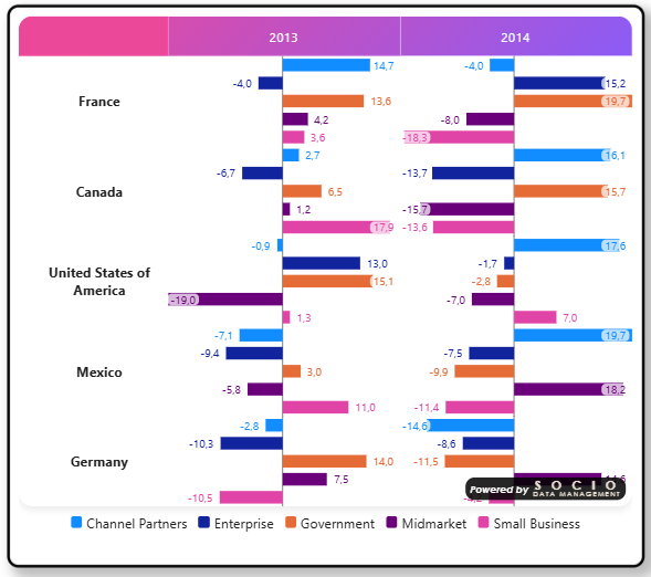
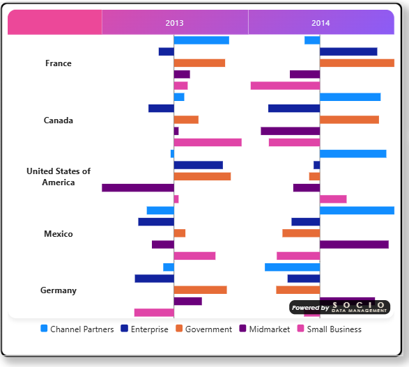
Shows or hides the bar's numeric label. This applies equally to a single bar (one per cell) and to bars merged by Group into one chart — grouped bars couldn't show a value at all before this setting existed. Turn it off (in either mode) to let the bar's length speak for itself, e.g. for a cleaner, less cluttered visual comparison.
Background (grouped bars only)
Setting: Background (dataBarValueBackground) · Type: Toggle · Default: On · Only shown when grouping is on and Show values is on
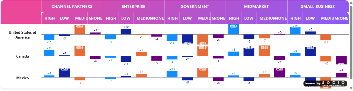
In grouped mode, each series draws its value directly next to (or on) its own bar, in that bar's own color. On a bar that fills most of the cell, that can put same-colored text over the bar itself — dark blue on dark blue, orange on orange — which is unreadable. Two ways to keep it legible:
| Background | Behavior |
|---|---|
| On (default) | A small translucent white pill is drawn behind the value wherever it lands, including directly on top of the bar. Bars keep the full height/width of the cell. |
| Off | No pill. Instead, a small margin is reserved above/below the bar (vertical bars) or beside it (horizontal bars) so the value always sits next to its bar, never on top of it — bars are drawn slightly shorter to make room for that margin. |
Turn Background off if you'd rather have genuinely shorter bars with plain-colored numbers beside them — e.g. for a flatter, more print/export-friendly look than a translucent pill gives you.
Force sign
Setting: Force sign (+/-) · Type: Toggle · Default: Off
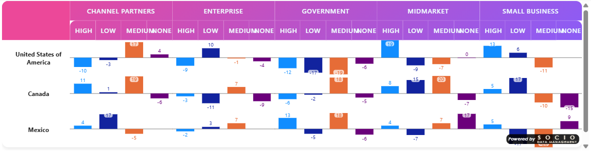
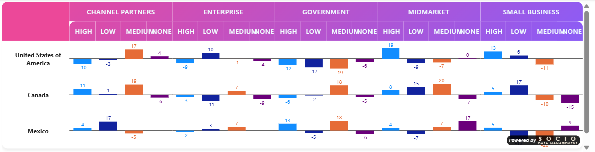
When on, positive values are always prefixed with an explicit + (e.g. +4.2) instead of relying on the natural minus sign for negatives only. Useful when the bar represents an écart and you want the direction to be unambiguous even when read out of context (tooltip, export).
Orientation
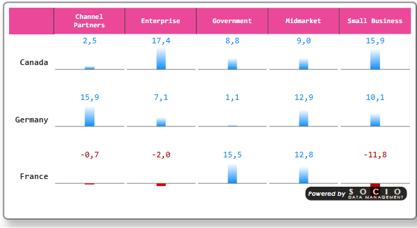
Setting: Bar orientation (dataBarOrientation) · Options: Vertical axis (horizontal bars), Horizontal axis (vertical bars) · Default: Vertical axis
| Orientation | Zero axis | Bar direction | Numeric label |
|---|---|---|---|
| Vertical axis (default) | Vertical line, centered in the cell | Horizontal bars extending left/right | To the right of the bar |
| Horizontal axis | Horizontal line, aligned the same way across a table row | Vertical bars extending up/down | Above the bar |
Use Vertical axis for the classic "one bar per row, reading down a column" layout (the most common case — see the Overview → What it looks like screenshot). Use Horizontal axis when you want bars to grow upward like a mini bar chart within each row, sharing a common baseline across the row.
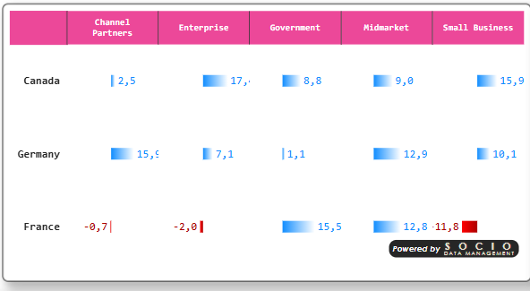
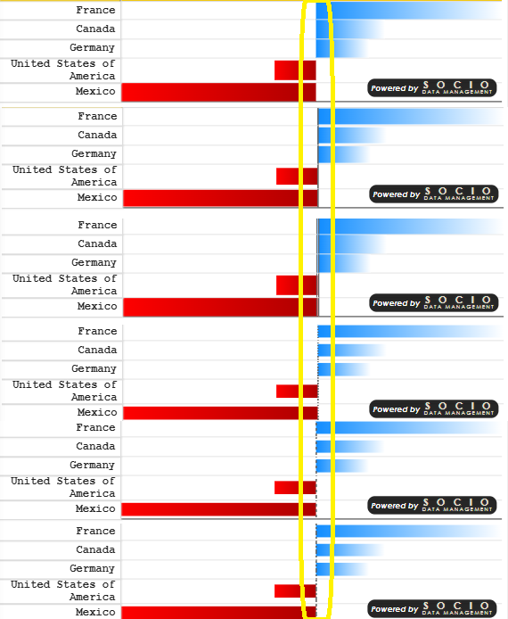
In Vertical axis orientation, the numeric label's natural width varies from row to row (sign, digit count). The visual automatically keeps every bar's zero axis aligned to the same pixel position down a column, regardless of label width — you don't need to do anything for bars to line up vertically.
Sizing
| Setting | Type | Default | Description |
|---|---|---|---|
| Bar height (px) | Number | 10 | Thickness of the bar, perpendicular to the value axis. |
| Bar track width (px) | Number | 60 | Legacy sizing hint; in the current layout the track automatically fills the available cell width/height, so this mostly matters for very old table exports. |
| Row height (px) (Table Format card) | Number | 0 (automatic) | Minimum height of each data row. Increase it to give bars (any orientation) more vertical room, especially with Horizontal axis orientation or thicker bars. |
Zero axis
Setting: Zero axis (dataBarAxisStyle) · Options: None, Line, Double line, Dotted line, Dashed line, Axis line · Default: None
Draws a reference line at the zero position of the track, on top of the bar. Axis line renders a drafting-style chain (long–short–long–short) reminiscent of technical/engineering axes; the other styles are self-explanatory.
Colors
Location: Format pane → Data Bar card → Bar colors group. Which fields show depends on Grouping, below: the diverging colors here only matter with no grouping, and the per-category swatches only matter with grouping on — the visual shows/hides them automatically.
Single bar (no grouping)
| Setting | Description |
|---|---|
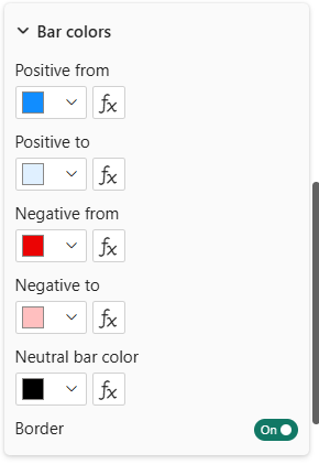
| Positive from | Solid color for bars representing a positive value (also the numeric label's color). |
| Positive to | Optional gradient end color for positive bars — leave empty for a solid Positive from fill. |
| Negative from | Solid color for bars representing a negative value (also the label's color). |
| Negative to | Optional gradient end color for negative bars — leave empty for a solid fill. |
| Neutral bar color | Color used when the value is exactly zero (or, in Follow Signif mode, when the cell isn't significant). |
| Border | Toggle. Draws a 1px border around every bar in its …from color — useful to keep faint or very light gradient colors crisp against the table background. |
How the gradient reads
When a …to color is set, the bar is rendered as a smooth gradient from …from (at the zero axis) to …to (at the bar's tip, i.e. the value end). This works for both orientations and both signs automatically — you only ever set one "from" and one "to" color per sign, and the visual figures out the physical direction (left/right or up/down) for each bar. A common effect is fading the tip toward white for a softer, less saturated look while keeping the color meaningful near the axis:
Positive from: #4472C4      Positive to: #FFFFFF
Negative from: #C0392B      Negative to: #FFFFFF

When Bar value is set to a Follow Signif Rule, the bar's color is primarily driven by the test's own significance colors (see Significance on Charts) — Positive/Negative from only act as a fallback when no override color is configured for that test, and gradients/borders configured here do not apply in that case (the significance overlay supplies its own background, gradient direction included).
Grouped mode — Bar colors group
When Group into one chart is on (see Grouping below), the Bar colors group instead shows one color swatch per distinct category (e.g. Yes, No, Maybe) — Power BI's native per-series color picker, same mechanism as Data Line. Each category gets a default color from the report's own color palette (the same theme-aware assignment Power BI uses for any chart's legend), and you can override any of them individually by clicking its swatch; the change is saved with the report like any other formatting choice.
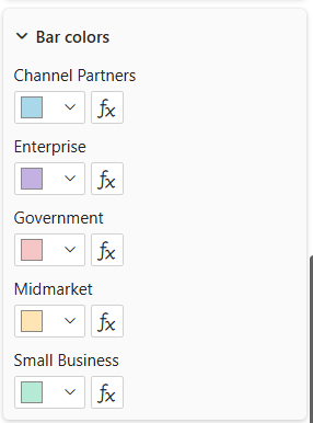
A category keeps the same color everywhere, even if it doesn't appear in every column-group — e.g. if one year only has Q3/Q4 while another has all four quarters, Q3 and Q4 still match the color they use elsewhere. Colors are assigned by category name, not by their position within a given group. Bar and Line overrides are stored independently (switching between the two doesn't carry your color picks across), but both fall back to the same report color palette when no override is set.
Color series — driving colors from a measure
Setting: Color series (dataBarColorSeries) · Format pane → Data Bar card → Bar colors group · Only visible when grouping is on
An alternative to manually clicking each category's swatch: pick a measure bound to the Additional Series data role (one value per category, e.g. a #RRGGBB hex string) and every category takes its color from that measure instead. Leave it on None to keep manually-picked/default palette colors. See Table Headers → Logos on a header for the sibling mechanism (Additional Series also feeds header logos).
📸 Screenshot databar-colorseries-settings.png (optional, still pending) — the Color series dropdown itself, with an Additional Series measure selected (distinct from the per-category swatches shown just above).
Grouping
Setting: Group into one chart (dataBarGroupBy) · Options: No grouping, Group last-level columns, Group last-level rows · Default: No grouping
Merges the last hierarchical level of columns (or rows) into a single cell containing one bar per series, each in its own series color, instead of one bar per individual cell. Useful when the last level is a small set of comparable categories (e.g. Yes/No, or three brands) that reads better as a small clustered chart than as separate columns.

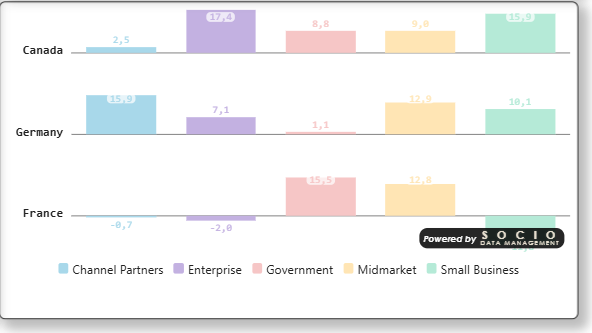
Each series gets its own color, overridable individually — see Colors → Grouped mode above.
A color legend for the series is shown under the table automatically when grouping is active, controlled by Data Bar's own Legend group (Show / Sort on label).
Grouped bars can show their value like a single bar can (see Show values) — since a value can land directly on its own bar in this mode, Background controls how that stays readable.
The per-test significance overlay (marker/icon/font/background — see Significance on Charts) currently decorates individual bars only. When Group into one chart is on, grouped bars use their series color and do not show the significance overlay.
Once a column or row level is merged into a grouped chart, its individual header label (e.g. each category name that used to head its own column, or label its own row) usually just repeats what the series legend already shows. See Table Headers → Hiding a header level to remove it cleanly — add a block for that level in the relevant ⚙ editor and uncheck Show this header.
Legend
Location: Format pane → Data Bar card → Legend group. Only visible/relevant when grouping is on.
| Setting | Type | Default | Description |
|---|---|---|---|
| Show | Toggle | On | Shows/hides the color legend drawn below the table. |
| Sort on label | Toggle | Off | Off (default) lists categories in Power BI's own data order — the order that best matches how your query returns them. On sorts entries alphabetically by category name instead. |
| Position | Top left/center/right, Bottom left/center/right | Bottom center | Where the legend sits relative to the table. It aligns to the chosen edge/center on a single row (wrapping only if it's too wide to fit), rather than being confined to a fixed third of the table's width. |
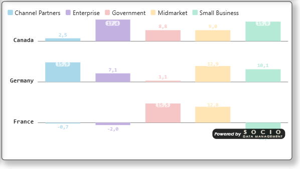
Data Bar and Data Line each have their own Legend group — they don't share settings, even though only one of the two can be active at a time (see Data Line). Set Show/Sort separately for each if you switch between them.
Value display
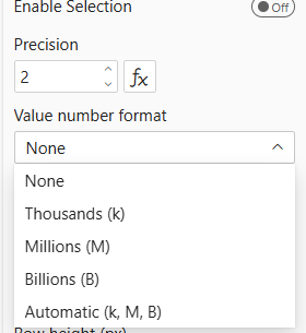
Setting: Value number format (Table Format card, shared with the rest of the table) · Options: None, k/M/B, Auto · Default: None
Controls whether large raw values (not percentages, not indices) are abbreviated on the bar's numeric label — e.g. 1.2M instead of 1200000. This keeps the label from crowding out the bar itself on wide-range mean/count tables. To show or hide the label entirely, see Show values; for grouped bars specifically, see Background for how the label stays readable over its own bar.
Troubleshooting
- All bars look the same tiny length → the table-wide scale is dominated by one outlier value (often a 100% total column in Horizontal % mode). Check Bar value — structural 100% totals are already excluded automatically for Horizontal % cell values, but a genuine outlier in your data will still compress the rest of the scale.
- Bars don't show at all → confirm Show data bars is on, and that the mapped Values series actually resolves a number for the mode you selected (e.g. Follow Signif 1 needs Significance Test 1 configured and mapped — see Significance Testing).
- Bar and Data Line both configured → the two are mutually exclusive; enabling one turns the other off.