Data Line Reference
Overview
Data Line is the mirror feature to Data Bar: instead of drawing a bar per cell, it plots one point per cell and connects consecutive points with a line — producing a sparkline-like trend that runs either down a column or across a row. It shares the same value logic and table-wide scale as Data Bar (same modes, same [min, max] handling), so switching between the two is mostly a styling decision.
Location: Format pane → Data Line card → master toggle Show data lines.
A cell renders either a Data Bar or a Data Line, never both — turning one on turns the other off automatically.
Line value — what positions the point
Setting: Line value (dataLineMode) · Options: Cell Value, Compare to Regex, Follow Signif 1/2/3 Rule · Default: Cell Value
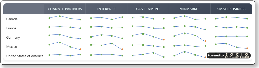
Identical semantics to Data Bar's Bar value: Cell Value follows the Value → Vertical % → Horizontal % → Indice priority from Table Content; Compare to Regex positions the point at the écart vs. a regex-matched reference column (Reference regex setting); Follow Signif 1/2/3 Rule positions it at the écart captured by that significance test, with the marker's color reflecting the test's verdict (see Significance on Charts).
Orientation
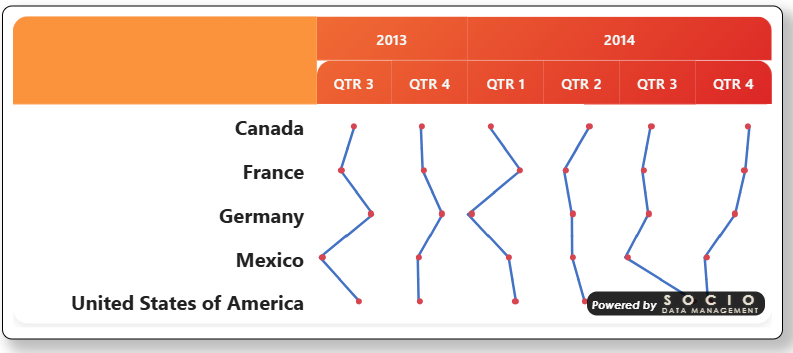
Setting: Line orientation (dataLineOrientation) · Options: Vertical lines (down rows), Horizontal lines (across columns) · Default: Vertical lines
| Orientation | One line per… | Point position in cell | Connects |
|---|---|---|---|
| Vertical lines (default) | Column | Horizontally, by value | Row N to row N+1 of the same column — a trend running down the table. |
| Horizontal lines | Row | Vertically, by value | Column N to column N+1 of the same row — a trend running across the table, broken automatically at each column sub-group boundary. |
Choose Vertical lines to see how a metric evolves as you read down the rows (e.g. one line per KPI column). Choose Horizontal lines to see, within a single row, how the metric moves across an ordered set of columns (e.g. a wave-over-wave or year-over-year trend).
Line & markers
| Setting | Type | Default | Description |
|---|---|---|---|
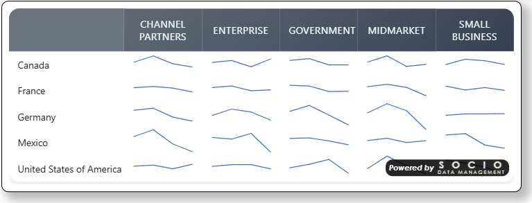
| Line thickness (px) | Number | 2 | Thickness of the connecting segments. |
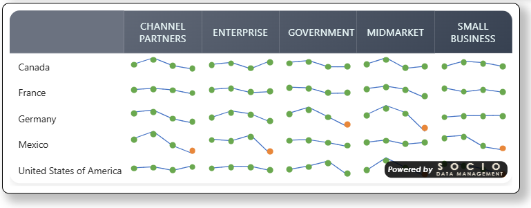
| Show markers | Toggle | On | Draws a dot at every data point, on top of the line. |
| Marker size (px) | Number | 5 | Diameter of the marker dot. |
Zero axis
Setting: Zero axis (dataLineAxisStyle) · Same options and behavior as Data Bar's Zero axis (None, Line, Double line, Dotted line, Dashed line, Axis line) — drawn as a reference line along the value axis.
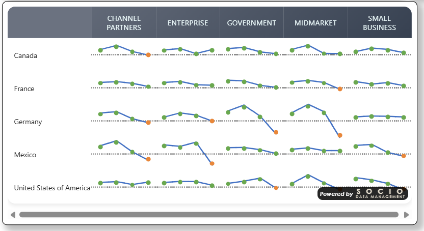
Colors
Location: Format pane → Data Line card. Which group applies depends on Grouping, below: the single-line settings only matter with no grouping, and the series settings only matter with grouping on — the visual shows/hides each group's fields automatically.
Single line (no grouping) — Series colors & Marker colors groups
| Setting | Group | Description |
|---|---|---|
| Line color | Series colors | Single color for the connecting line segments — does not vary by sign. |
| Positive marker color | Marker colors | Marker color for positive values (or positive significance in Follow Signif mode). |
| Negative marker color | Marker colors | Marker color for negative values (or negative significance in Follow Signif mode). |
| Neutral marker color | Marker colors | Marker color when the value is exactly zero (or, in Follow Signif mode, not significant). |
Unlike Data Bar, Data Line does not offer a gradient "to" color or a border toggle — the line itself is always a solid color, and only the markers carry the positive/negative/neutral distinction.

Grouped mode — Series colors group
When Group into one chart is on (see Grouping below), the Series colors group instead shows one color swatch per distinct category (e.g. Qtr1, Qtr2, Qtr3, Qtr4) — Power BI's native per-series color picker. Each category gets a default color from the report's own color palette (the same theme-aware assignment Power BI uses for any chart's legend), and you can override any of them individually by clicking its swatch; the change is saved with the report like any other formatting choice.
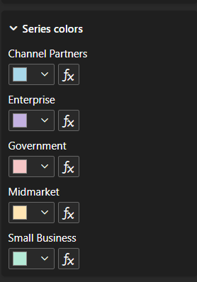
A category keeps the same color everywhere, even if it doesn't appear in every column-group — e.g. if one year only has Q3/Q4 while another has all four quarters, Q3 and Q4 still match the color they use elsewhere. Colors are assigned by category name, not by their position within a given group.
Color series — driving colors from a measure
Setting: Color series (dataLineColorSeries) · Format pane → Data Line card → Series colors group · Only visible when grouping is on
An alternative to manually clicking each category's swatch: pick a measure bound to the Additional Series data role (one value per category, e.g. a #RRGGBB hex string) and every category takes its color from that measure instead. Leave it on None to keep manually-picked/default palette colors. See Data Bar → Color series — same mechanism, independent storage.
📸 Screenshot — Format pane settings dataline-colorseries-settings.png (optional, still pending) — the Color series dropdown itself (single field, not the per-category swatches above), with an Additional Series measure selected.
Grouping
Setting: Group into one chart (dataLineGroupBy) · Options: No grouping, Group last-level columns, Group last-level rows · Default: No grouping
Same principle as Data Bar's Grouping: merges the last hierarchical level into a single cell, drawing one point per series (each in its own series color, see Colors above) instead of one point per individual cell, with a color legend shown under the table.

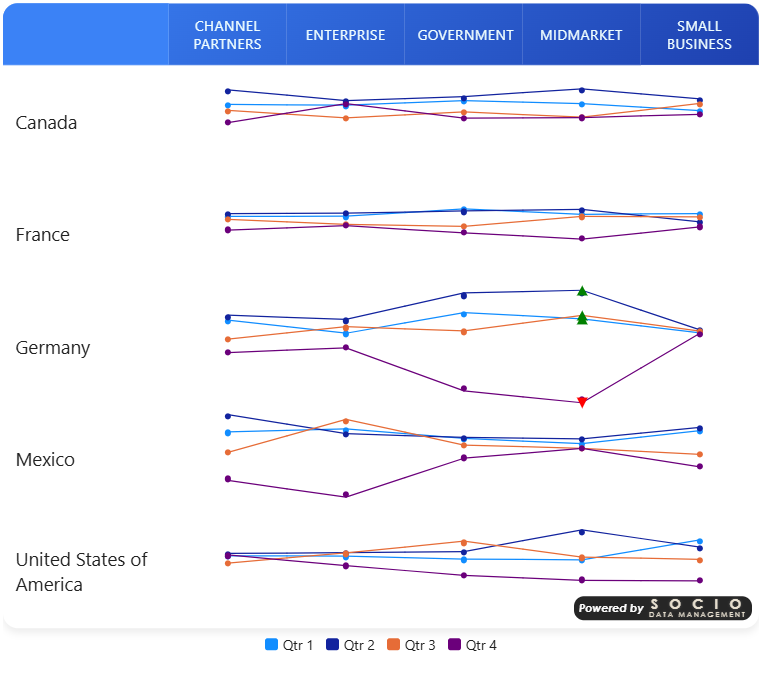
Group separators (toggle, default On) — when grouping is active, draws a subtle vertical separator at each upper-level group boundary (where the line necessarily breaks), so the break stays visually readable even with table borders turned off.
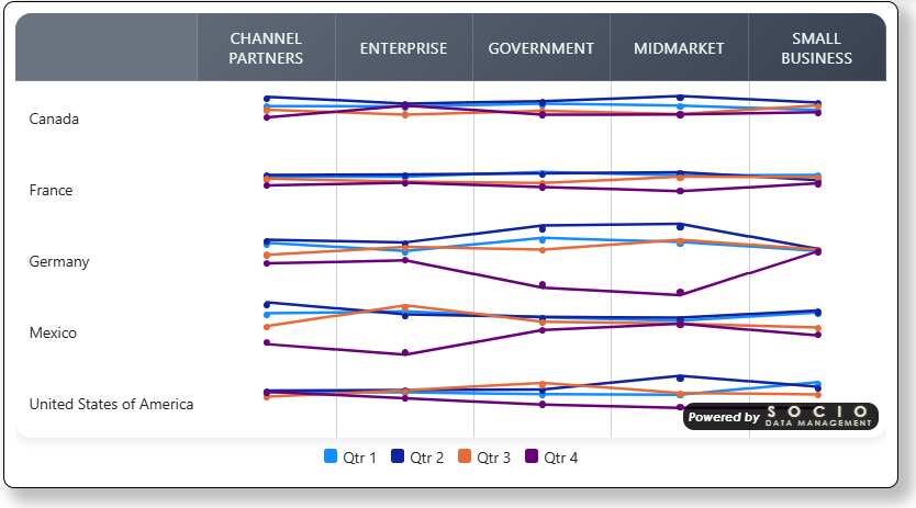
As with Data Bar, the per-test significance overlay does not apply to grouped lines — grouped points use their series color only.
See Table Headers → Hiding a header level to remove a now-redundant column or row label cleanly, instead of leaving it in place once the series legend already shows the same category names.
With Group last-level rows and 2-level row grouping (a sub-table per top-level row category, e.g. one per country), each sub-table only ever produces one merged cell per column — there's no second point in the same sub-table to connect to vertically. Connecting each series' point from one sub-table down to the next (e.g. the same year, across countries) isn't implemented yet; you get isolated points there rather than a broken line. The horizontal case (connecting across columns within one sub-table, the far more common use — e.g. a trend across years) works as expected.
Legend
Location: Format pane → Data Line card → Legend group. Only visible/relevant when grouping is on.
| Setting | Type | Default | Description |
|---|---|---|---|
| Show | Toggle | On | Shows/hides the color legend drawn below the table. |
| Sort on label | Toggle | Off | Off (default) lists categories in Power BI's own data order — the order that best matches how your query returns them. On sorts entries alphabetically by category name instead. |
| Position | Top left/center/right, Bottom left/center/right | Bottom center | Where the legend sits relative to the table. It aligns to the chosen edge/center on a single row (wrapping only if it's too wide to fit), rather than being confined to a fixed third of the table's width. |
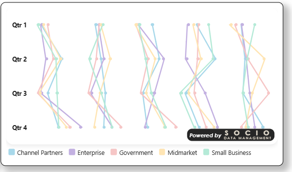
Data Bar has its own Legend group — they don't share settings, even though only one of the two can be active at a time (see Data Bar). Set Show/Sort separately for each if you switch between them.
Troubleshooting
- Line looks broken in unexpected places → in Horizontal lines orientation, the line always breaks at column sub-group boundaries by design (it never crosses from one Level-1 group of columns into the next). This is what Group separators makes visible.
- No line at all, only markers → check Line thickness isn't 0, and that consecutive cells both have a resolvable value for the selected mode (a missing value on either side of a segment breaks that segment only).
- Markers don't reflect significance colors → confirm Line value is set to a Follow Signif Rule — in Cell Value or Compare to Regex mode, markers follow the plain positive/negative/neutral colors, not significance.