CrossTable InCell Charts
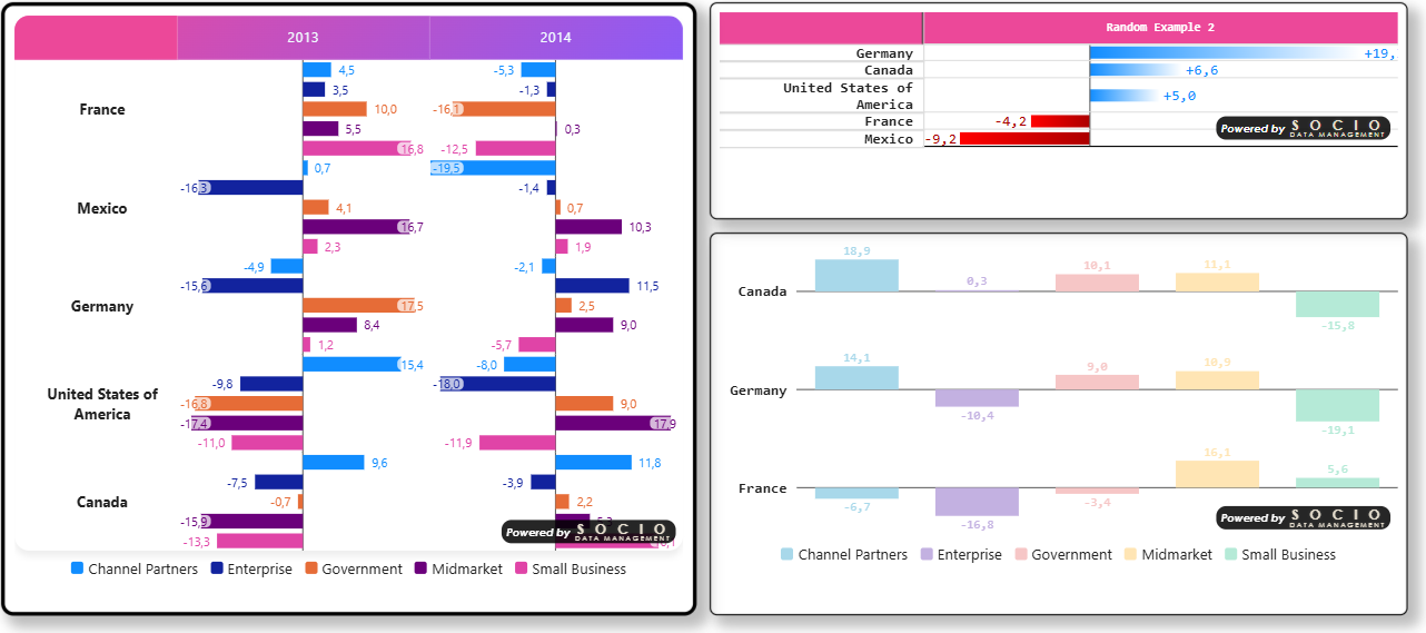
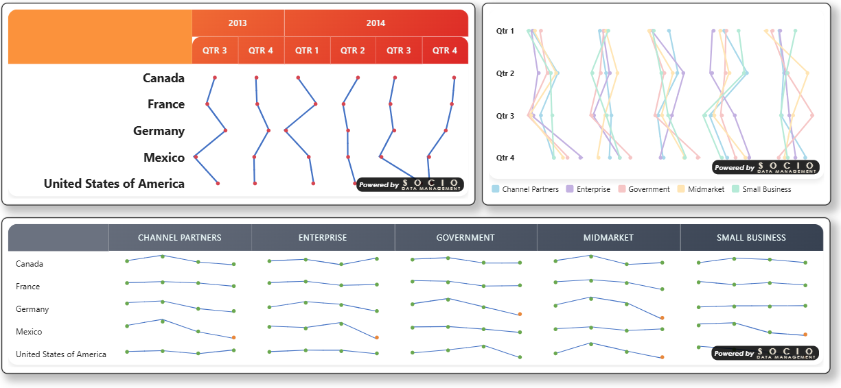
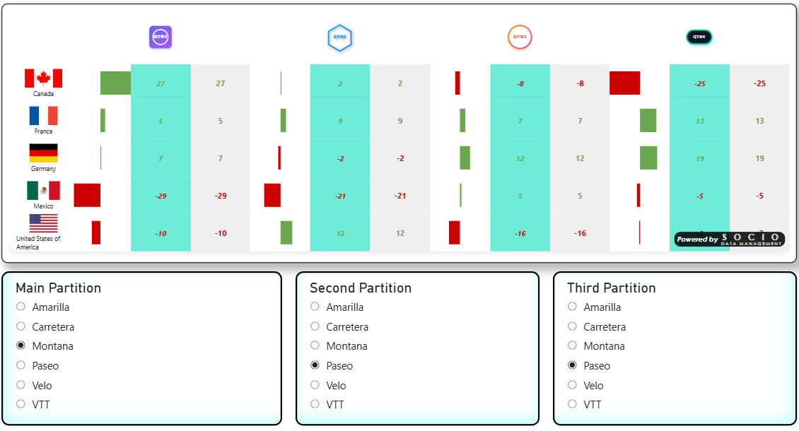
CrossTable InCell Charts is the companion visual to SDM Cross Table Tool. It builds the exact same hierarchical cross-tabulation table — same data roles, same percentage/mean engine, same significance tests, same totals and thresholds — but replaces the plain numeric cells with small diverging charts drawn directly inside each cell: a Data Bar (a horizontal or vertical bar per cell) or a Data Line (a point connected across cells, forming a sparkline-like trend). An optional Gap Mode goes one step further, collapsing a whole group of columns into 1–3 synthetic "main vs. average" / "main vs. competitor" gap columns — the classic brand-comparison chart.
Think of it as a Power BI custom visual dedicated to the "in-cell chart" pattern popularized by spreadsheet conditional-formatting bars — but hierarchical, statistically aware, and stylable like the rest of the SDM table family.
What it looks like
Data Bar — a diverging bar per cell, table-wide axis, single or grouped (see Data Bar):
Data Line — a connected point per cell, forming a sparkline-like trend across columns (see Data Line):
Gap Mode — a column group collapsed into "main vs. average / vs. competitor" gap columns, configured through its own card and ⚙ editor (see Gap Mode and the Gap Mode tutorial):
Why a separate visual?
CrossTable InCell Charts was split out from CrossTable so each visual can stay focused:
- CrossTable is the full-featured crosstab: numeric cells, Ranking badges/gradients, Cell Rules conditional decoration, Tile Mode, per-cell text alignment.
- CrossTable InCell Charts trades those table-centric features for Data Bar and Data Line — and the settings that make sense specifically for charts (bar/line colors, orientation, zero-axis style, per-series grouping, chart-friendly significance overlays).
Everything not related to that trade-off — data roles, series mapping, significance test configuration, totals, thresholds, sorting, logos, table styles and color themes, licensing — works exactly the same way in both visuals. Existing CrossTable reference documentation applies to CrossTable InCell Charts unless a page below says otherwise.
Feature comparison
| Feature | CrossTable | CrossTable InCell Charts |
|---|---|---|
| Percentage & Mean tables, hierarchical rows/columns | ✅ | ✅ |
| Value / % Vertical / % Horizontal / Indice series | ✅ | ✅ |
| Significance testing (Item vs Other, Item vs Total, Regex, Previous visible column, Previous row) | ✅ | ✅ |
| Significance testing — All Columns (lettered A/B/C… symbols) | ✅ | ❌ (see Significance on Charts) |
| Totals, sub-totals, base rows | ✅ | ✅ |
| Thresholds & masking (incl. Cell Base / Cell Unweighted Base) | ✅ | ✅ |
| Sorting (rows & columns) | ✅ | ✅ |
| Logos (column & row headers) | ✅ (dedicated data roles — see Logos) | ✅ (unified Table Headers editor + lookup) |
| Table styles & 21 color themes | ✅ | ✅ (+ Snow theme — see Color Themes) |
| Row header format override, freeze panes | ✅ | ✅ (via Table Headers) |
| Row title fixed width | ✅ | ✅ |
| Cell Tooltip (native Power BI tooltip on hover — bases, index, significance confidence…) | ✅ | ✅ (including "Group into one chart" merged cells — see Cell Tooltip) |
| Zebra striping | ✅ | ❌ |
| Cell text alignment override | ✅ | ❌ |
| Ranking (badges, color gradients) | ✅ | ❌ |
| Cell Rules (conditional cell decoration) | ✅ | ❌ |
| Tile Mode | ✅ | ❌ |
| Data Bar (in-cell diverging bar chart) | ❌ | ✅ |
| Data Line (in-cell connected point / sparkline) | ❌ | ✅ |
| Gap Mode (main-vs-average / main-vs-competitor gap columns) | ❌ | ✅ |
| Row height control, abbreviated value format (k/M/B) | ❌ | ✅ |
| Excel export (Pro) | ✅ | ✅ |
If you need Ranking, Cell Rules or Tile Mode, use CrossTable. If you want the crosstab's numbers turned into small in-cell bars or trend lines, use CrossTable InCell Charts. Nothing stops you from placing both visuals on the same report page side by side — they read the same kind of data model.
Data roles
CrossTable InCell Charts uses the same data roles as CrossTable:
| Data Role | Description |
|---|---|
| Row Variable | Row dimension(s) — hierarchical, supports multiple levels |
| Column Variables | Column dimension(s) — hierarchical, supports multiple levels |
| Values | Numeric measure(s) populating the cells (count, mean, base, unweighted base, significance series…) |
| Merge Formula | Optional DAX expression merging modalities |
| Additional Series | Optional measures, each constant per column/row category — feeds Table Headers' Logo series and Data Bar/Data Line's Color series, picked by measure name in the relevant card. |
See Percentage Series and Mean Series for how to map Values to Value / Base / Unweighted Base / Significance roles — this mapping drives both the numeric content and what a Data Bar / Data Line can chart (see Data Bar).
The recommended way to put a logo in a header is the Header logos lookup (label → base64, resolved entirely in the visual) — see Table Headers → Header logos. Additional Series (above) is only needed for the cost profile a lookup can't cover: cases where a header's logo needs to be dynamically computed, not just looked up by category name.
Where to go next
- Data Bar — diverging bar chart per cell: modes, orientation, colors and gradients, border, zero-axis style, grouping.
- Data Line — connected points across cells: markers, thickness, grouping, group separators.
- Significance on Charts — how significance test results are shown when the cell content is a chart instead of a number.
- Gap Mode — replace a column group's partitions with 1–3 "main vs. average / vs. competitor" gap columns, styled through a dedicated ⚙ editor. See also the Gap Mode tutorial for a full worked example.
- Table Headers — per-level column/row header presentation (background, font, logo, layout, free-form CSS) through two ⚙ editors, plus a zero-cost logo lookup. See also the Header Logos tutorial for wiring a DAX measure into it.
- Everything else (series, totals, thresholds, sorting, styles, licensing) is documented under CrossTable Reference and applies unchanged.
CrossTable InCell Charts is licensed independently from CrossTable — it is a separate product listing with its own Free/Pro editions (Free shows the "Powered by Socio Data Management" watermark and disables Excel export; Pro removes both). See Editions Comparison.