Significance on Charts
Significance tests — what is compared, at what confidence level, with which variance method — are configured exactly the same way as in CrossTable. See Significance Testing for the full reference (test types, confidence levels, regex targeting, legend). This page only covers what's different when the test result decorates a chart (Data Bar / Data Line) instead of a plain table cell.
No "All Columns" (lettered) testing
CrossTable's All Columns test type marks each cell with a letter (A, B, C…) identifying which other specific column it is significantly different from. That only makes sense next to a printed number — there is nowhere to put a legible letter on a 10px-tall bar.
CrossTable InCell Charts therefore only offers:
| Test type | Available |
|---|---|
| None | ✅ |
| All columns (lettered) | ❌ |
| Item vs question item | ✅ |
| Item versus Total (Base) | ✅ |
| Regular expression | ✅ |
| Previous visible column | ✅ |
| Previous row | ✅ |
| Partition Gap (Gap Mode only) | ✅ |
All the remaining test types produce a simple verdict per cell — higher (+1), lower (−1), or not significant (0) — which is exactly what a chart overlay needs.
Partition Gap doesn't exist as a general-purpose test — it doesn't compute anything outside of Gap Mode, where it drives the Gap vs 2nd/Gap vs 3rd columns specifically (main partition vs. the named competitor). Picking it for a significance slot while Gap Mode is off, or while neither gap column is shown, simply does nothing. See Gap Mode → Significance drives color for the full picture of which test decorates which gap column.
The chart overlay
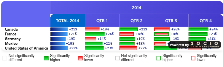
Instead of coloring table cell backgrounds/borders and printing letters, each active, significant test applies its configured view as a chart decoration:
| View | Effect on Data Bar | Effect on Data Line |
|---|---|---|
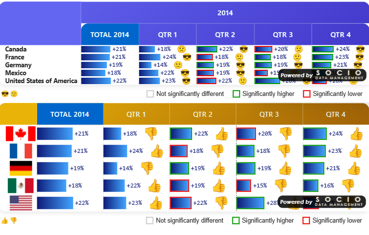
| Font color | Colors the numeric label next to the bar. | (no label to color — no effect) |
| Background color | Colors the bar's fill — solid, or a gradient if a Gradient end color is set for that sign (see Significance colors below). | (no fill to color — no effect) |
| Marker | A colored shape (circle / square / diamond / triangle — see Legend) at the bar's tip. | A colored shape at the data point. |
| Icon | The default green/red triangle, or your custom base64 icon, at the bar's tip. | The default/custom icon at the data point. |
| Border color | (not used — border is reserved for CrossTable's plain cell rendering) | (not used) |
Configure the view per test (Significance 1 / 2 / 3 each have their own Significance view option), exactly as in CrossTable.
📸 Screenshot — rendered result sigcharts-overlay-databar-views.png — the same significant Data Bar cell shown 4 times, one per usable view (Font color, Background color, Marker, Icon), for side-by-side comparison.

This table describes an ordinary Data Bar/Data Line cell. Gap Mode cells are a genuine cell (not a bare chart mark), so Border color does work there — see Gap Mode → Bar vs. Number.
When several tests are significant on the same cell
- Font color and Background color are single values — if more than one active test requests them on the same cell, the first matching test (1, then 2, then 3) wins.
- Marker and Icon stack — you can see, for example, test 1's icon and test 2's marker on the same bar tip at once.
📸 Screenshot — rendered result sigcharts-stacking-example.png — a bar tip showing two decorations at once: one test's icon and another test's marker, stacked.
Significance colors & gradients
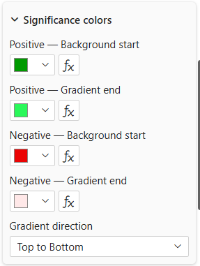
Location: Format pane → Significance card → Significance colors group (shared with CrossTable).
| Setting | Description |
|---|---|
| Positive — Background start | Override color for a significantly-higher verdict. Feeds both the table's cell background (in CrossTable) and the chart's Background/Font views (here). Leave empty to use the style theme's default. |
| Positive — Gradient end | If set, the Background view becomes a gradient from Background start to this color instead of a solid fill. |
| Negative — Background start / Negative — Gradient end | Same, for a significantly-lower verdict. |
| Gradient direction | 6 directions (Top↔Bottom, Left↔Right, both diagonals) — applies to the significance gradient specifically, independent of Data Bar's own axis-to-tip gradient direction (see Data Bar Colors). |
Data Bar's Positive/Negative from/to (in the Data Bar card) color the bar based on its sign, regardless of significance. Significance's Background start/Gradient end (in the Significance card) color it based on a test's verdict, and only take effect when Bar value is set to a Follow Signif Rule and that test's view is Background color. When both could apply, the significance colors win — see Data Bar Colors.
Marker shapes & custom icons
- Marker shape — Circle, Square, Diamond or Triangle, set per test (Significance 1 / 2 / 3), used when that test's view is Marker.
- Custom icon (base64) — replace the default green/red triangle with your own image, set per test and per direction (Custom icon positive, Custom icon negative), used when that test's view is Icon.
📸 Screenshot — rendered result sigcharts-markershapes-montage.png — the four marker shapes (Circle, Square, Diamond, Triangle) compared side by side on otherwise identical bars.
Legend
The significance legend (labels, suffixes, font) works identically and can be shown under the table regardless of whether the underlying cells are plain numbers or charts.
Position (legendPosition) · Options: Top, Bottom · Default: Bottom — CrossTable InCell Charts-only addition. Moves the whole legend above or below the table; its own left/center/right layout (centered with one active test, spread left/right with two or three — see Significance Legend → Layout) is unchanged. Independent from the Data Bar/Data Line series legend's Position, which additionally offers left/center/right control — the two legends can be placed on opposite sides of the table so they never compete for space.
📸 Screenshot — rendered result sigcharts-legend-top.png — the significance legend shown above the table (Position: Top).
📸 Screenshot — rendered result sigcharts-legend-bottom.png (optional) — the same legend shown below the table (Position: Bottom, the default).
Grouped charts
The overlay described on this page decorates individual Data Bar/Data Line elements. When Group into one chart is active, grouped series bars/points use their series color only — the significance overlay does not currently apply in grouped mode.