Explore Table Features - Detailed Walkthrough
Overview
SDM Cross Table Tool offers extensive customization options organized into logical sections in the Format panel. This guide walks you through each feature section, explaining what it does and where to learn more.
1. Table Contents
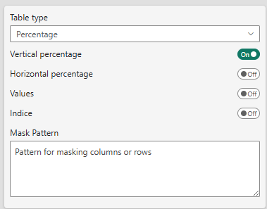
What it controls: The fundamental data display and aggregation settings
This section determines:
- Table type (Percentage vs Mean)
- Which metrics to display (values, percentages, indices)
- Data masking patterns
- Multiple answer mode configuration
Key decisions here:
- Choose between percentage analysis or mean analysis
- Toggle vertical/horizontal percentages
- Enable indice calculations
- Set up masking patterns for sensitive data
When to use: Configure this section first, as it defines what your table displays and how data is aggregated.
📖 Learn more: Table Contents Reference
2. Sorting Settings
What it controls: How rows and columns are arranged in your table
This section allows you to:
- Sort rows alphabetically or by column values
- Specify sorting direction (ascending/descending)
- Pin specific rows/columns to first or last positions
- Choose which metric to sort by (value, percentage, indice)
Key decisions here:
- Alphabetical sorting for consistency
- Value-based sorting for insights (highest sales first)
- Fixed positioning for totals and special categories
When to use: After your data is displaying correctly, configure sorting to highlight insights or maintain consistent presentation.
📖 Learn more: Sorting & Ordering Reference
3. Ranking Settings
What it controls: Visual highlighting of top/bottom performers
This composite section includes:
- Basic Settings: Ranking scope, order, and display method
- Custom Colors: Define your own color gradients
- Exclude Range: Prevent middle values from being colored
Key decisions here:
- Choose ranking scope (global, per row, per column)
- Select display format (numbered badges or color gradients)
- Configure color intensity and schemes
When to use: Add ranking after basic table setup to visually emphasize performance differences.
📖 Learn more: Ranking & Visualization Reference
4. Cell Rules
What it controls: Conditional decoration of individual cells (color, label, badge, or full CSS) driven by rules you write directly in the visual
This section allows you to:
- Write
condition : outputrules, evaluated top-to-bottom on each cell — the first matching rule wins - React to the cell's own computed values (
pctV,pctH,indice,value,base,avg,signif1,signif2) and to header labels (col1…,row1…) - Color backgrounds or text, prepend labels, add colored badges, or apply full custom CSS (gradients, bold, alignment…)
- Add a
defaultcatch-all for cells no other rule matches
Key decisions here:
- Choose the display mode (cell background, text color, label, badge, or Custom CSS)
- Write conditions with numeric and header variables (remember
pctV/pctHare fractions 0–1) - Pick a badge shape when using badge mode
When to use: When you need conditional formatting that reacts to the numbers the visual actually displays — no DAX measure required.
📖 Learn more: Cell Rules Reference
5. % Series Usage
What it controls: Data series mapping for percentage tables
This section appears when Table Type is set to "Percentage" and manages:
- Value series (the counts to display)
- Base series (denominators for percentages)
- Unweighted base series
- Significance testing series
- Multiple answer mode toggle
Key decisions here:
- Map your data measures to appropriate series
- Configure weighted vs unweighted bases
- Set up series for statistical testing
When to use: Essential for percentage tables with custom measures or weighted data.
📖 Learn more: Percentage Series Configuration
6. Mean Series Usage
What it controls: Data series mapping for mean tables
This section appears when Table Type is set to "Mean" and manages:
- Mean series (the averages to display)
- Count series (sample sizes)
- Standard deviation series
- Significance testing series for means
- Unweighted base series
Key decisions here:
- Map your numerical measures
- Include sample size information
- Configure standard deviation for statistical analysis
When to use: Essential for mean tables to properly aggregate and display average values.
📖 Learn more: Mean Series Configuration
7. Significance Settings
What it controls: Statistical testing and difference highlighting
This composite section includes:
- Base Settings: Test types, confidence levels, variance methods
- Test 1 Configuration: Display and comparison options
- Test 2 Configuration: Additional test layer
Key decisions here:
- Choose test type (all columns, item vs total, regex)
- Set confidence level (90%, 95%, 99%)
- Select visual display method (icon, color, border)
When to use: When you need to highlight statistically significant differences between groups.
📖 Learn more: Significance Testing Reference
8. Totals
What it controls: Display of total rows, base rows, and subtotals
This section manages:
- Total column display
- Base row configuration
- Unweighted base row
- Subtotals for hierarchical levels
- Base row positioning (top/bottom)
- Custom labels for special rows
Key decisions here:
- Show/hide totals and bases
- Position base rows at top or bottom
- Customize row labels
- Configure subtotals for multi-level tables
When to use: Configure after basic table setup to add context rows.
📖 Learn more: Totals & Subtotals Reference
9. Threshold
What it controls: Data quality warnings and value masking
This section allows you to:
- Set warning thresholds (visual alerts)
- Set masking thresholds (hide values)
- Choose threshold basis (cell value, base, unweighted base)
- Configure empty cell display for zero values
Key decisions here:
- Warning level for small sample sizes
- Masking level for data protection
- What to base thresholds on
When to use: Important for survey data or any analysis with variable sample sizes.
📖 Learn more: Thresholds & Masking Reference
10. Table Format Settings
What it controls: Visual appearance and styling
This composite section includes multiple cards:
Table Options Card
- Hover highlighting
- Zebra rows
- Selection mode
- Percentage symbol display
- Decimal precision
- Freeze panes
- Row title width
- Column header visibility
Style Settings Card
- Pre-defined style themes (Custom, Modern, Classic, Scientific, Market Research)
- Cell text size
- Color themes (20+ options)
- Row title text alignment
Element Formatting Cards
- Top Level Header: Fonts, colors, backgrounds
- Sub Level Header: Hierarchical header styling
- Cell Format: Data cell appearance
Key decisions here:
- Choose a theme or create custom styling
- Set freeze panes for navigation
- Configure fonts and colors for branding
- Adjust decimal precision for your audience
When to use: Configure styling after data and structure are finalized, or apply pre-defined themes immediately for quick professional appearance.
📖 Learn more: Formatting & Styling Reference
11. Logos
What it controls: Display of images (logos) inside row and column headers
This section allows you to:
- Bind a base64 image measure to each header level —
colLogoLv1,colLogoLv2,colLogoLv3for columns androwLogoLv1,rowLogoLv2for rows - Turn logos on/off globally with Show logos
- Choose a display mode per level: Logo only, Logo above text, or Logo under text
- Set the logo size (px) independently for each level
Key decisions here:
- Provide a DAX measure returning a base64 image (PNG, JPEG…) for each header level you want to brand
- Decide whether the logo replaces or accompanies the header text
- Adjust per-level sizes so logos align consistently across headers
When to use: To brand your table with company or product logos in the headers — for example competitor or key-account comparisons.
📖 Learn more: Logos in Headers Reference
Typical Configuration Workflow
Here's a recommended order for configuring your table:
Phase 1: Foundation (Required)
- Table Contents: Choose table type, select what to display
- Series Configuration: Map your data (% or Mean series)
- Totals: Add base rows and total columns
Phase 2: Analysis (Optional)
- Sorting: Arrange for insights or consistency
- Significance: Highlight statistical differences
- Ranking: Visual performance indicators
- Thresholds: Data quality controls
Phase 3: Presentation (Final)
- Table Format: Apply styling and themes
- Fine-tune: Adjust fonts, colors, precision
Feature Dependencies
Some features depend on others:
| Feature | Requires |
|---|---|
| Vertical % | Base series configured |
| Significance Testing | Significance series configured |
| Ranking | Ranking enabled |
| Indice | Value and base series |
| Threshold Masking | Threshold enabled |
Quick Reference: What Each Section Does
| Section | Primary Purpose | When to Configure |
|---|---|---|
| Table Contents | Define data type and display | First |
| Sorting | Arrange rows/columns | After data displays |
| Ranking | Visual highlights | After basic setup |
| Cell Rules | Conditional cell decoration | After values display |
| % Series | Map percentage data | With Table Contents |
| Mean Series | Map mean data | With Table Contents |
| Significance | Statistical testing | After analysis decisions |
| Totals | Context rows | After basic setup |
| Threshold | Data quality | After totals |
| Table Format | Visual styling | Last (or use themes first) |
| Logos | Branding in headers | With Table Format |
Common Configuration Scenarios
Scenario 1: Simple Survey Report
1. Table Contents: Percentage table, vertical %
2. Totals: Show total column, base row
3. Table Format: Apply "Market Research" theme
→ Done!
Scenario 2: Performance Analysis with Ranking
1. Table Contents: Percentage table, vertical %
2. Sorting: Sort by "Total" column, descending
3. Ranking: Enable ranking, color gradient
4. Totals: Total column, base row at top
5. Table Format: "Modern" theme
→ Highlights top performers automatically
Scenario 3: Statistical Comparison
1. Table Contents: Percentage, vertical % + horizontal %
2. % Series: Configure all series including significance
3. Significance: Test 1 = All columns, Test 2 = vs Total
4. Totals: Base row, signif base row
5. Threshold: Warn below n=50
6. Table Format: Custom styling for brand
→ Full statistical analysis table
Next Steps
Now that you understand what each section does:
- Start Simple: Configure Table Contents and Totals first
- Add Analysis: Try Sorting or Ranking
- Go Advanced: Explore Significance and Thresholds
- Polish: Apply themes or customize formatting
📖 Reference Guides: Explore detailed settings for each section using the links above
🎯 Use Cases: See real-world examples in Business Cases
❓ Need Help?: Start with the Quick Start Guide for basics
Troubleshooting by Section
Table displays incorrectly
→ Check: Table Contents, Series Configuration
Can't find my data
→ Check: Table Contents (masking), Series Configuration
Numbers don't add up
→ Check: Series Configuration, Totals settings
Visual appearance issues
→ Check: Table Format Settings (fonts, colors, precision)
Ranking/Significance not working
→ Check: Series Configuration
For detailed troubleshooting, see each section's reference guide.