Significance Testing Reference
Overview
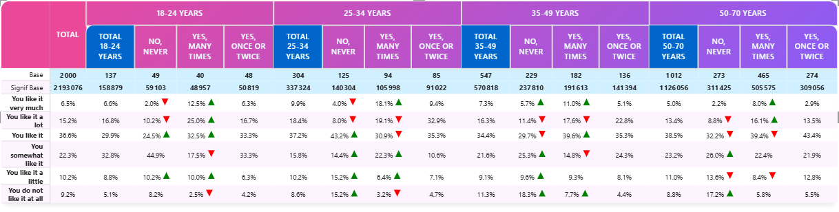
The Socio Data Management Power BI cross table tool lets you identify statistically significant differences between groups in your data in several manner, depending on your configuration. All feattures includes:
- Three independent significance tests per table
- Multiple test types (All columns, Item vs other, Item vs total, Regex, Previous visible column, Previous row)
- Various display options (icon, font color, background color, border color)
- Configurable confidence levels (90%, 95%, 99%)
- Configurable variance methods for percentage tables (pooled, separate)
This page covers the test types and settings shared by both visuals. CrossTable InCell Charts drops All Columns (no room for lettered A/B/C markers on a chart) and adds one chart-specific type, Partition Gap, used only inside Gap Mode to compare the main partition against its named 2nd/3rd competitor. See Significance on Charts for what's different when a test decorates a chart instead of a plain cell.
Test Configuration
Significance Test 1
Setting: Significance 1
Options: None, All columns, Item vs other question item, Item versus Total (Base), Regular expression, Previous visible column, Previous row
Default: None
Significance Test 2
Setting: Significance 2
Options: Same as above
Default: None
Significance Test 3
Setting: Significance 3
Options: Same as above
Default: None
Each test compares different aspects of your data. The three tests are fully independent — each has its own type, display option, regex, and custom icons — and they are not mutually exclusive: several tests can point at the same cell, and you are free to give two or three of them the same symbol (see Combining tests with the same symbol).
Test Types Explained
None
No significance testing is performed.
All Columns
Compares each column against all others in the table.
ABCDEFGHIJKLMNOPQRSTUVWXYZabcdefghijklmnopqrstuvwxyzαβγδεζηθικλμνξοπρστυφχψωΓΔΘΛΞΠΣΦΨΩ🅰🅱🅲🅳🅴🅵🅶🅷🅸🅹🅺🅻🅼🅽🅾🅿🆀🆁🆂🆃🆄🆅🆆🆇🆈🆉ⓐⓑⓒⓓⓔⓕⓖⓗⓘⓙⓚⓛⓜⓝⓞⓟⓠⓡⓢⓣⓤⓥⓦⓧⓨⓩ
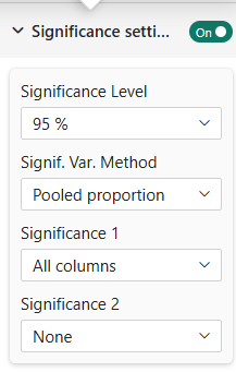
Use Case: Determine which regions have significantly different satisfaction scores
Example:
 | 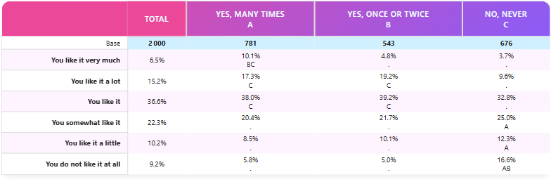 |
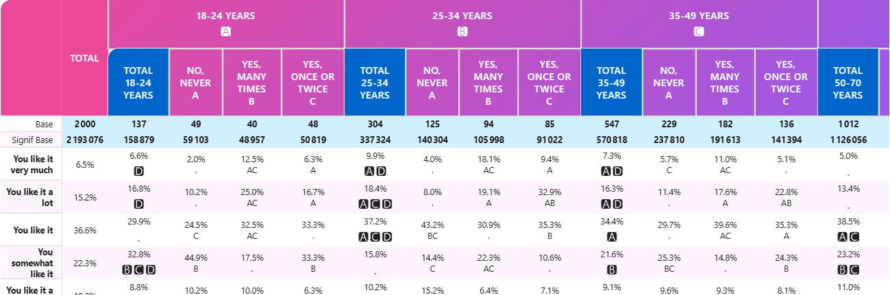
Note that when you have more than one level of column, the significance markers will appear differently per level to avoid confusion.
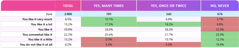
Item vs Other Question Item
Compares one response option against all others.
This test is the most used for survey data analysis. You should always prefer this test vs 'Against Total' when comparing response options.
Use Case: Highlight if one product preference is significantly different
Example:
Item versus Total (Base)
Compares each item to the overall average at the same level.
This test has been implemented for legacy purpose and is not generally recommended for any analysis. The reason is that observation (population) of the tested values should always be independent. In this test the observations of each cell is included in the total so it does not ensure this independency rule. Unless you have a good reason, prefer the 'Item vs Other Question Item' test instead.
Regular Expression
Uses a regex pattern to identify columns to compare.
This option is extremely useful when you are focusing on a brand, a population or a product and want to know which "competitors" are significantly lower or higher.
Example 1: You want to compare the age group "50-70 years" against all other age groups in a satisfaction survey.
In this example, we have two levels of columns but the regex matches only one item on the first level (50-70):
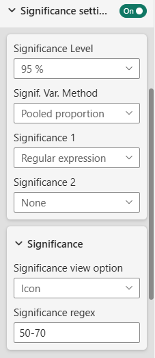 | 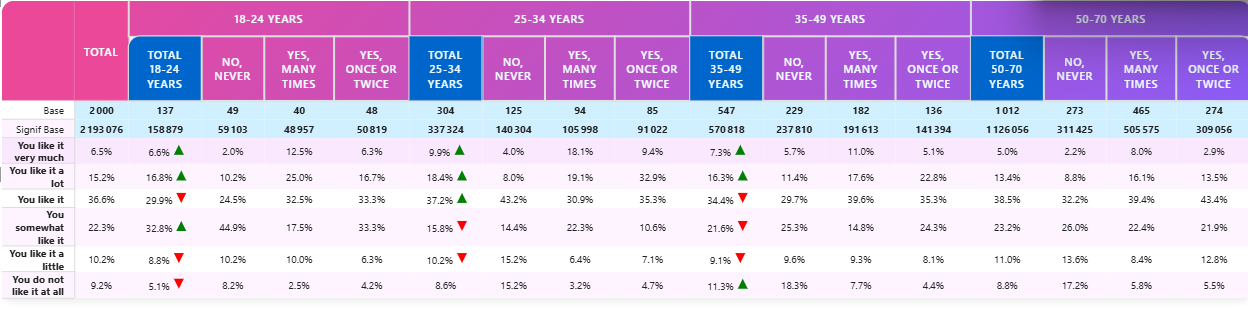 |
The regex pattern used here is 50-70 which matches partially the column with label "50-70 years".
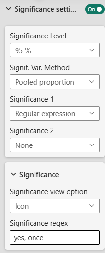
Example 2: You want to compare respondents who answered "yes, once or twice" against all other response options in a survey question split by age groups.
In this second example, we match on level two, "yes, once" ich matches columns "Yes, once or twice" under each age group: In this case, only every columns compares to this matched column in each subgroup:
 | |
Regex level
Setting: Regex level Options: Same Level, Level 1, Level 2 Default: Same Level
Controls on which column depth the regex looks for the reference and how the comparison cascades through the column hierarchy.
-
Same Level (default — historical behavior)
The regex is matched anywhere in the column hierarchy and the reference column is compared with its direct siblings (cells sharing the same parent). No comparison is propagated to deeper aggregations. -
Level 1
The regex must match at the first column level. For every cell at any deeper aggregation, the reference is the cell sharing the same coordinates except for the level‑1 dimension, where the value matches the regex. -
Level 2
Same logic, but the regex is anchored at the second column level.
Example: with columns Year > Country > Brand and the regex 2024 at Level 1, the test produces:
| Compared cell | Reference (regex-matched) |
|---|---|
2025 aggregate | 2024 aggregate |
2025 / FR aggregate | 2024 / FR aggregate |
2025 / FR / Renault leaf | 2024 / FR / Renault leaf |
2026 / UK / Peugeot leaf | 2024 / UK / Peugeot leaf |
| … | … |
The reference branch (2024) itself is never flagged.
A read‑only Regex match status field is displayed under the regex input. It shows the column paths actually matched by the current regex (or a sample of available column titles when nothing matches), making it easy to diagnose a regex that does not produce the expected highlights.
Previous Visible Column
Compares each column to the nearest visible column before it, at the same depth in the column hierarchy — skipping over any columns hidden by a Mask Pattern.
Use Case: Track a single brand's evolution year over year, or any period-over-period comparison, without cluttering the table with every other response option.
This test is what makes a "previous period" comparison work even when you have hidden most of the columns. For example, with columns Year > Brand and a mask that keeps only MyBrand visible under each year (NOT BrandName = "MyBrand"), each year effectively shows a single leaf column. This test aligns each one with the previous visible leaf column — 2022 vs. 2021, 2023 vs. 2022, and so on — even though 2022 / MyBrand and 2021 / MyBrand don't share the same immediate parent column-wise; they're simply the two closest visible leaves in table order.
The very first visible column at a given depth has no previous visible column to compare against, so it is never marked significant by this test.
This test runs at every level of the column hierarchy independently, not just the leaves. If your top-level columns (e.g. the years themselves) aren't masked, you'll also get a year-over-year comparison at that level, in addition to the leaf-level one.
Previous Row
Compares each row to the previous row in the table, in the same column — a row-over-row equivalent of Previous visible column, useful when your rows are an ordered sequence (a scale, a ranking, consecutive periods represented as rows instead of columns).
Use Case: Flag which item in an ordered list of rated items jumps significantly compared to the one just above it.
Unlike All Columns (which uses each column's own total as the sample size), this test uses each row's own base — consistent with the Rows are repeated items setting, where every row is an independent item with its own respondent base.
Native Power BI subtotal rows are automatically skipped — both as a row being tested and as a candidate "previous row" — so a subtotal never gets compared, and the row right after it compares against the last real data row above the subtotal, not the subtotal itself.
The first row in the table (or the first row after any leading subtotal) has no previous row to compare against, so it is never marked significant by this test.
Confidence Level
Significance Level
Setting: Significance level
Options: 90%, 95%, 99%
Default: 95%
The confidence threshold for determining significance.
- 90%: More lenient (flags more differences)
- 95%: Standard business level
- 99%: Strict scientific standard
You usually do not change this settings. Choose a higher level (99%) for critical decisions.
The pass/fail marker only tells you whether a cell crossed this threshold. To see the actual, continuous confidence level for every cell — independent of this setting — enable Significance confidence level in the Cell Tooltip.
Variance Method (Percentage Tables Only)
Setting: Signif. Var. Method
Options: Pooled proportion, Separate proportion
Default: Pooled
How variance is calculated when comparing percentages.
- Pooled: Treats all groups as one population (more conservative)
- Separate: Treats groups separately (more sensitive to differences)
In usual situation, leave the default to Pooled proportion.
Choose Separate proportion option when group sizes differ greatly.
Display Options
View Option
Setting: Significance view option
Options: Icon, Font Color, Background Color, Cell border Color
Default: Icon
How significant values are marked:
Icon: Small symbol/marker appears in cell (Red for significantly lower, Green for significantly higher)
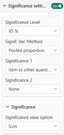 | 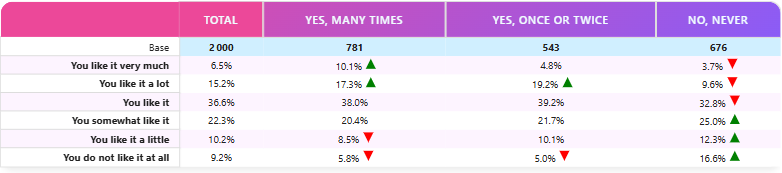 |
You can replace the default green/red SVG triangles with your own images. When the view option is set to Icon, two additional fields appear in the significance settings:
- Custom icon positive (base64): Paste a base64 data URI (
data:image/png;base64,…) to use a custom image for positive significance. - Custom icon negative (base64): Paste a base64 data URI for negative significance.
Leave either field empty to keep the default SVG triangle for that direction. Custom images are displayed at 12 × 12 px, vertically centered in the cell.
Font Color: Text color changes red or green to highlight significance
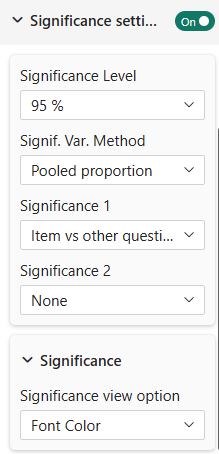 | 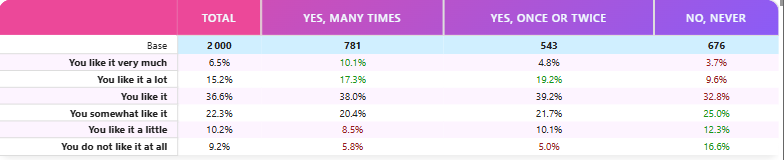 |
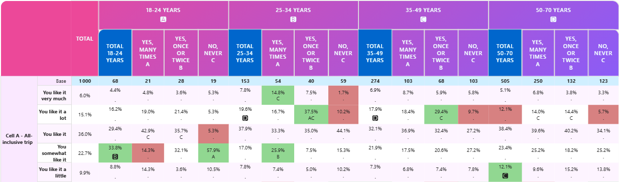
Background Color: Cell background changes red or green to highlight significance
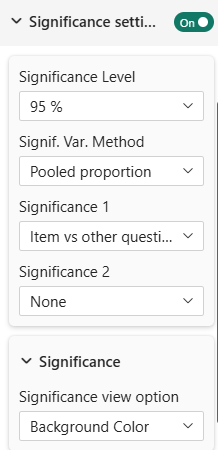 | |
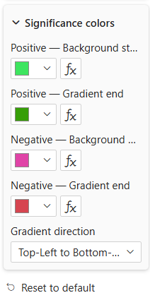 | When you choose background color, you can also choose to apply a gradient custom colors instead of a solid color. Choosing this option will make a new option appear to solect the gradient colors and the orientation of gradient. |
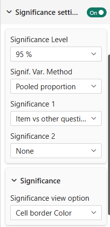
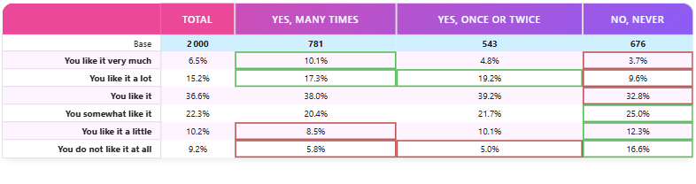
Border Color: Cell border changes red or green to highlight significance
 |  |
Significance Legend
The Legend sub-card (inside Significance Settings) adds an automatic legend below the table that explains the significance markers to report readers. Enable it with the Show legend toggle at the top of the sub-card.
Display Modes
The legend automatically adapts its content to match the display mode(s) actively used by your significance test(s):
Background / Border mode
When at least one significance test uses Background or Border display, the legend shows three colored squares with editable labels:
- A square in the neutral cell background color → label defaults to "Not significantly different"
- A square in the positive significance color → label defaults to "Significantly higher"
- A square in the negative significance color → label defaults to "Significantly lower"
All three labels support the fx button (DAX measure binding) for dynamic, filter-context-sensitive text.
Icon mode
When at least one significance test uses Icon display, the legend shows the actual icons (custom image or default SVG triangles) beside an editable text label for each active significance test (Signif 1 label, Signif 2 label, Signif 3 label). A matching Signif n label suffix field lets you append a dynamic value (via the fx button) without creating a dedicated DAX measure for the full text — the program concatenates the two parts with a space.
Font Color mode
When at least one significance test uses Font Color display, the legend renders "123/123" in green (positive) and red (negative) beside an editable text label for each active significance test. The same suffix fields apply.
Layout
| Active significance tests | Legend layout |
|---|---|
| 1 test active | Centered below the table |
| 2 or 3 tests active | Blocks spread across the row (first left-aligned, last right-aligned, others distributed between) |
CrossTable InCell Charts' Legend sub-card has an extra Position setting (Top/Bottom, default Bottom) controlling whether the legend sits above or below the table. It only moves the whole legend — the left/right layout described in the table above is unchanged. See Significance on Charts → Legend.
Font Settings
All legend text shares a single FontControl (font family, bold, italic, underline, size) configurable in the Legend sub-card.
Label Settings
| Setting | Description | Default |
|---|---|---|
| Neutral label | Label for the neutral color square (background/border mode) | "Not significantly different" |
| Positive label | Label for the positive color square (background/border mode) | "Significantly higher" |
| Negative label | Label for the negative color square (background/border mode) | "Significantly lower" |
| Signif 1 label | Text label for significance 1 (icon / font color mode) | (empty) |
| Signif 1 label suffix | Dynamic suffix appended after the Signif 1 label | (empty) |
| Signif 2 label | Text label for significance 2 (icon / font color mode) | (empty) |
| Signif 2 label suffix | Dynamic suffix appended after the Signif 2 label | (empty) |
| Signif 3 label | Text label for significance 3 (icon / font color mode) | (empty) |
| Signif 3 label suffix | Dynamic suffix appended after the Signif 3 label | (empty) |
All label fields support the fx button for DAX measure binding, allowing the legend text to update dynamically based on filter context.
:::tip Composing dynamic labels without extra measures
The suffix fields are designed for cases where the label has a fixed prefix and a dynamic part. For example, set Signif 1 label to "Significantly different from" (constant) and bind Signif 1 label suffix to a DAX measure that returns the currently selected reference value. The visual concatenates them with a space — no need to create a dedicated measure just to produce the full sentence.
:::
Advanced Testing
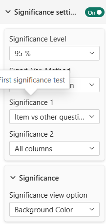
Multiple Test Configuration
You can configure up to three tests, each independently:
- Different display methods for each test
- Different test types simultaneously
- Regex patterns for flexible comparison
 |  |
Combining tests with the same symbol
The tests are not mutually exclusive. Because each test writes its own result on every cell, you can point several tests at the same cell and, if you wish, mark them with the same symbol (same view option and, for icons, the same custom image).
This is what lets you express an OR relationship. For example, to flag every cell that is significantly different from column A or column B, set up two Regular expression tests — one matching A, the other matching B — and give both the same icon. A cell that is significant against either reference then carries that single symbol.
When two or three tests resolve to the same icon on the same cell, the icon is drawn once (the union is not duplicated). Font-color, background and border modes stack as CSS classes, so keep those on distinct tests if you want to tell them apart.
Hide First Variable
Hides the first variable in comparative displays for cleaner visuals (see masking in table-content).
Statistical Background (For Reference)
What Tests Are Used?
For percentage tables: Chi-square test of independence
For mean tables: T-tests or ANOVA (depending on number of groups)
Interpretation
A cell marked as significant means:
- The difference between groups is unlikely due to chance
- At the chosen confidence level
- Given the sample sizes
Important Notes
- Significance depends on sample size (large samples show more differences)
- Practical significance ≠ statistical significance (a 1% difference might be statistically significant but not practically important)
- Always consider context, not just statistics
Series Configuration for Testing
Significance tests require special data series:
For Percentage Tables:
- Significance Series: The counts/values used for testing
- Base Series: The total base for calculating proportions
For Mean Tables:
- Mean Series: The mean values to test
- Standard Deviation Series: Measure of variability
- Count Series: Sample size
Configure these in data settings under:
- "Significance Series" (percentage tables)
- "Mean Series for Significance" (mean tables)
Best Practices
- Choose Appropriate Test: Match test type to your question (all columns vs vs-total)
- Clear Display: Use one view option per test for clarity
- Document Level: Note which significance level you're using in reports
- Consider Sample Size: Small sample sizes can miss real differences
- Practical Significance: Don't rely solely on statistics; consider business context
Troubleshooting
Q: Significance markers don't appear
A: Ensure you've configured significance series in data settings
Q: All cells are marked significant
A: Your significance level might be too lenient (90%); try 99%
Q: No cells marked significant
A: Check sample sizes; very small groups won't show significance
For more help, see the Quick Start Guide or contact support.